Product88%
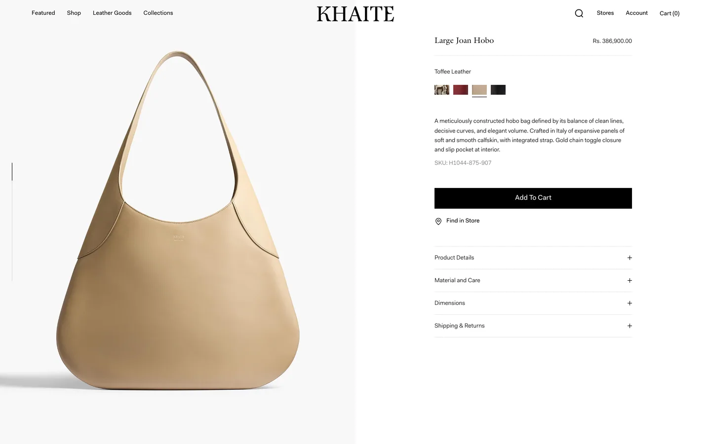
Low-friction size and option selection
Variant controls remain visible beside image stack.
View this implementationCurated launch dataset for RecoverBase browsing.
Variant controls remain visible beside image stack.
View this implementationA prominent, stable add-to-cart button lifts immediate buyer action when visible without scrolling on product pages for single, clearly priced items, especially if mobile sessions are significant.
View this implementationA sticky add-to-cart bar lifts mobile add-to-cart rates when product pages scroll past two screens, mobile sessions exceed 40%, and the product has a single clear call to action. But it adds UI weight, potentially harming slow pages, confusing complex configurations, or causing layout shifts if not implemented cleanly.
View this implementation
Age verification reduces checkout abandonment only when it answers a specific shopper question or reduces real uncertainty. It adds UI friction; any duplication or visual noise can cause abandonment.
View this implementationAn allergen warning lifts add-to-cart rate when it answers a specific shopper question or reduces real uncertainty on the product page. Skip it if it duplicates information or adds visual noise; 0 of 4 sampled stores currently implement this.
View this implementationUse cart discount input only when it addresses a specific shopper question or reduces uncertainty on the cart page, and is visible without scrolling. It adds visual noise and hurts performance when it duplicates information or lacks clear purpose. 0 of 3 sampled stores implement this.
View this implementationCart upsells reliably increase items per order when complementary products add with one tap. Skip them if the cart is empty, products need variant selection, or checkout friction is already high; they add distraction.
View this implementation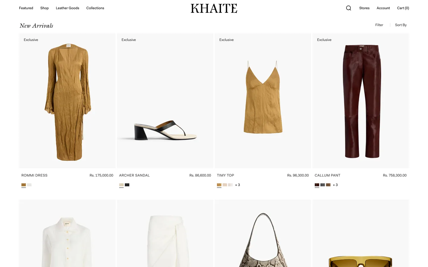
Category page filters reduce shopper uncertainty and improve experience when visible at the decision moment. Skip them if they duplicate obvious information, add visual noise, or hurt page performance.
View this implementationProduct cards on a category page reliably improve scanning speed and perceived quality when they display a clear image, name, and price without hover interactions, and maintain consistent image aspect ratios, especially for touch devices.
View this implementationCategory page quick add helps shoppers narrow options when it answers a specific question or reduces uncertainty, and appears at the decision moment. It adds visual noise and can hurt performance if it duplicates information or offers no clear benefit.
View this implementationA category page sort bar reduces shopper uncertainty when it answers a specific question on the category page and is visible at the decision moment. It adds visual weight; skip it if it duplicates obvious information, adds noise without purpose, or degrades page performance.
View this implementationA cookie banner helps only when it answers a specific shopper question or reduces real cross-page uncertainty, visible at the decision moment. It adds UI weight; skip it if it duplicates information, adds visual noise, or strains page performance.
View this implementationImplement a currency selector only when it reduces shopper uncertainty across multiple pages and is visible at the decision moment. Skip it if it adds visual noise, duplicates information, or impacts performance; zero of seven sampled stores implement it.
View this implementationAn exit-intent popup can reduce shopper uncertainty across pages if it appears at the decision moment. The gain is real but rare; zero of seven sampled stores implement this. It often adds visual noise without clear purpose.
View this implementationA fit finder reliably lifts add-to-cart rate when it directly answers a shopper question or reduces uncertainty on the product page, visible at the decision moment. It adds UI weight and scan cost if it duplicates information, adds visual noise, or hurts page performance.
View this implementationA free shipping bar lifts shopper confidence when it resolves a specific uncertainty across multiple pages and is visible at the decision moment — but it adds scan cost if it duplicates information, creates visual noise, or burdens page performance.
View this implementationA free shipping threshold lifts cart page conversion when it resolves a clear shopper uncertainty at the decision moment. The gain is real but modest, and it adds enough visual weight that unclear or redundant messages can hurt more than they help.
View this implementationImplement a GST calculator only when it directly answers a specific shopper question or reduces real uncertainty at checkout, and is visible at the decision moment. It often duplicates information, adds visual noise, or impacts page performance. Zero of one sampled stores currently implement one.
View this implementationHome best sellers helps shoppers when it directly answers a specific question or reduces real uncertainty on the homepage. Otherwise, it adds visual noise and can hurt page performance, especially if it duplicates information.
View this implementationUse home category tiles when they reduce a specific shopper uncertainty on the homepage and appear without scrolling. Skip them if they duplicate information, add visual noise, or hurt page performance.
View this implementationA home top section reduces immediate bounce when it clearly shows what the store sells within 5 seconds. Luxury brands benefit from editorial heroes; commodity brands need product-forward ones.
View this implementationUse a home trust strip when it directly answers a specific shopper question or reduces a real uncertainty at the decision moment. Otherwise, it adds visual noise, duplicates information, or burdens page performance. Zero of 7 sampled stores use this pattern.
View this implementationAn ingredient glossary on a product page lifts conversion only when it answers a specific shopper question or reduces uncertainty at the decision moment. Skip it if it adds visual noise, duplicates information, or hurts page performance.
View this implementationAn ingredient list for skincare lifts add-to-cart when it directly answers a specific shopper question or reduces real uncertainty on the product page, and is visible at the decision moment. Skip it if it duplicates information or adds visual noise without a clear purpose.
View this implementationA jewelry ring sizer reduces shopper uncertainty when it directly answers a specific question on the product page and is visible at the decision moment. Otherwise, it adds clutter. Zero of four sampled stores implement it, indicating it is not a universal solution.
View this implementationA kids age filter improves category page experience when it reduces real shopper uncertainty; otherwise, it adds visual noise and scan cost. Skip it if it duplicates information or lacks a clear purpose.
View this implementationA language selector reduces shopper uncertainty only when it addresses a specific, cross-page question and is visible at the decision moment. Otherwise, it adds visual noise and scan cost, especially given its low prevalence in sampled stores.
View this implementationUse a live chat widget when it reduces specific shopper uncertainty across pages and is visible at the decision moment. Skip it if it adds visual noise, duplicates information, or strains page performance.
View this implementationA localized returns policy helps when it answers a specific shopper question or reduces real uncertainty at the decision moment. Its value is conditional: it adds scan cost and visual noise if it duplicates information or impacts page performance without clear utility.
View this implementationUse this when mega menu answers a specific shopper question or reduces a real uncertainty at cross-page. Skip it when mega menu duplicates information already obvious from the page.
View this implementationA pet breed filter helps when it answers a specific shopper question or reduces uncertainty on the category page and is visible at the decision moment. It harms when it duplicates information, adds visual noise without purpose, or impacts page performance.
View this implementationPost-purchase upsells succeed when they enable one-click additions of complementary, lower-priced items. Skip them if payment re-entry is required, or if the primary purchase was high-value/high-consideration, as these erode trust or trigger doubt.
View this implementationA product page image gallery is effective when visual evaluation drives purchase decisions; include hero, lifestyle, detail, and scale images. Skip for commodity products where a single, clear image is enough for recognition.
View this implementationImplement product page shipping ETA when it reduces a real shopper uncertainty at the decision moment. It clarifies a specific question, but adds UI weight. Skip if it duplicates information, creates visual noise, or hurts page performance.
View this implementationA product page variant selector reduces shopper uncertainty and lifts clarity when visible at the decision moment. Skip it if it duplicates information or adds visual noise without clear purpose.
View this implementationRegional payment chips reduce shopper uncertainty at checkout when they answer a specific question and appear at the decision moment; otherwise, they add visual noise and hurt page performance.
View this implementationA returns policy strip lifts confidence when it reduces real shopper uncertainty across multiple pages and is visible at the decision moment. The gain is real but modest; it adds visual weight, and slow pages can hurt more than they help.
View this implementationVisible reviews consistently lift conversion on product pages for significant purchases, provided at least 5 genuine customer reviews are available. Omit the widget if reviews are absent or unmoderated.
View this implementationUse a search bar when it resolves specific shopper uncertainty across pages and is visible at the decision moment; otherwise, omit it. It adds clutter, duplicates information, and can hurt page performance. Notably, 0 of 8 sampled stores currently implement this.
View this implementationSize charts lift clothing sales when they resolve a specific shopper question or reduce real uncertainty on the product page, and appear at the decision moment. Skip if they duplicate information or add visual noise without clear purpose.
View this implementationImplement 'Size chart — kids' when it directly answers a shopper question or reduces uncertainty on category pages, visible at the decision moment. Otherwise, it adds visual noise, duplicates information, or hurts performance.
View this implementationImplement a shoe size chart when it reduces real shopper uncertainty on the product page, visible when shoppers choose a size. Skip it if it adds visual noise or duplicates existing information; its effectiveness depends on context.
View this implementationSocial proof blocks reduce shopper uncertainty and lift confidence when they answer a specific question or reduce a real doubt, visible at the decision moment. But they add visual noise and scan cost if they duplicate information or lack a clear purpose.
View this implementationTrust badges reduce checkout abandonment for first-time buyers of brands with low recognition, particularly when placed near the payment field. Avoid them for established brands, returning customers, or if certifications are inactive.
View this implementationAn urgency timer lifts conversion when it answers a specific shopper question or reduces uncertainty across pages, and appears at the decision moment. The gain is real but narrow, and it adds UI weight that often fails to earn its space.
View this implementationA VAT-inclusive label on the product page adds clarity when it resolves a specific shopper uncertainty and is visible at the decision point. Otherwise, it risks visual noise and duplicates obvious information.
View this implementationUse a multi-currency toggle when it resolves shopper uncertainty across product pages and is visible at the decision moment; skip it if it duplicates information, adds visual noise, or strains page performance.
View this implementationA newsletter popup improves engagement when it resolves a specific shopper question or reduces cross-page uncertainty at the decision point. Otherwise, it adds visual noise, duplicates information, and can degrade page performance.
View this implementationNutrition information lifts shopper confidence when it directly answers a specific question or reduces uncertainty on the product page. It backfires if it duplicates content, adds visual noise, or negatively impacts page performance; 0 of 4 sampled real stores showed these issues.
View this implementationUse the payment options block when it reduces shopper uncertainty or answers a specific question at the decision moment. Otherwise, skip it; the block adds visual noise, duplicates information, or impacts page performance.
View this implementationBreadcrumbs reliably help users orient and navigate parent categories on sites with at least two catalog levels and organic search traffic. Skip them for flat structures or on mobile if they wrap above the page title, pushing content off the initial screen.
View this implementation