Product
Sticky add-to-cart on Khaite
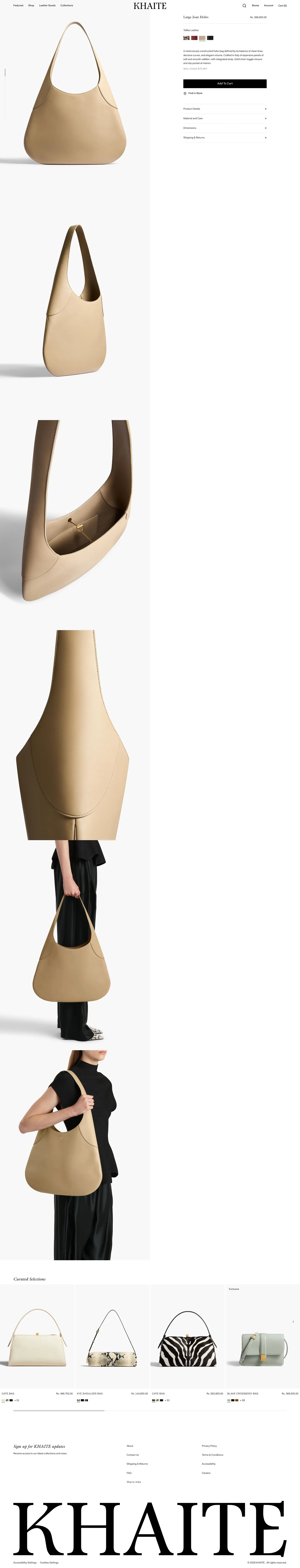
Recorded example of the sticky add-to-cart pattern on Khaite (product page). RecoverBase describes what this brand chose to publish and cites outside research. This is observation, not a promise of results for your store.
- Vertical
- Luxury fashion
- Stage
- Product
- Platform
- Shopify
- Verified
- 2026-05-16
- Confidence
- 0%
- Region
- US store
Start here
- You are viewing one pattern applied to one brand. Sections below spell out structure, UX research, trade-offs, and sources.
- On wide screens, use On this page at left to jump around, then open Screenshot for the capture.
First visit? A short strip under the site menu explains RecoverBase once. Dismiss it whenever you like.
A sticky add-to-cart bar lifts mobile add-to-cart rates when product pages scroll past two screens, mobile sessions exceed 40%, and the product has a single clear call to action. But it adds UI weight, potentially harming slow pages, confusing complex configurations, or causing layout shifts if not implemented cleanly.
What it is
A sticky add-to-cart bar improves mobile experience on long product pages with simple calls to action, but requires careful implementation to avoid performance issues and user confusion.
- A sticky add-to-cart bar lifts mobile add-to-cart rates when product pages scroll past two screens, mobile sessions exceed 40%, and the product has a single clear call to action. But it adds UI weight, potentially harming slow pages, confusing complex configurations, or causing layout shifts if not implemented cleanly.
- A sticky add-to-cart bar may improve add-to-cart rates when product pages scroll past two full viewport heights, mobile sessions exceed 40%, and the product has a single clear call to action.Inferred
- Evidence suggests skipping this bar for short product pages where the native add-to-cart button remains visible, or for products requiring complex variant selection, as it may add confusion.Inferred
- If pages already struggle with Core Web Vitals, avoid implementation unless a clean approach can prevent layout shifts.Inferred[ref-sticky-add-to-cart-sticky-injected-dom-shift] web.dev (Google) (2026)[ref-sticky-add-to-cart-sticky-layout-shift-misclick] web.dev (Google) (2026)
What research says
Sticky add-to-cart bars reduce effort on mobile by being thumb-friendly, but require careful implementation to avoid layout shifts and screen real estate costs.
- A bottom-anchored bar on mobile tends to sit closer to the natural thumb zone than a control far up the page. This may reduce effort on long product pages.Inferred
- Injecting a sticky add-to-cart bar after initial paint causes layout shift unless space is reserved for it up front.[ref-sticky-add-to-cart-sticky-injected-dom-shift] web.dev (Google) (2026)
- An unreserved or late-mounting sticky bar may cause shoppers to click the wrong control at the decisive moment. It can overlap live page content.Inferred[ref-sticky-add-to-cart-sticky-layout-shift-misclick] web.dev (Google) (2026)
- A persistently pinned bar consumes viewport real estate. Its benefit should outweigh this cost.Inferred[ref-sticky-add-to-cart-sticky-screen-real-estate-tradeoff] Nielsen Norman Group (2026)
- A pinned element earns its place when it stays unobtrusive, high-contrast, minimally animated, and matches a real user need.[ref-sticky-add-to-cart-sticky-persistent-usefulness-conditions] Nielsen Norman Group (2026)
- Two out of five sampled stores implement a sticky add-to-cart bar. Both observed variants are bottom bars on mobile.
Trade-offs
Sticky bars can backfire by delaying interactive time, causing layout shifts, consuming screen real estate, and competing with browser UI.
- A sticky bar adds a persistent UI layer. On slow networks, it may delay interactive time, representing a tradeoff between conversion and page weight.Inferred
- Dynamically injecting a sticky add-to-cart bar after initial paint causes layout shift. This can lead to shoppers misclicking controls at critical moments.[ref-sticky-add-to-cart-sticky-injected-dom-shift] web.dev (Google) (2026)[ref-sticky-add-to-cart-sticky-layout-shift-misclick] web.dev (Google) (2026)
- A persistently pinned bar consumes viewport real estate. Its benefit should justify this cost.Inferred[ref-sticky-add-to-cart-sticky-screen-real-estate-tradeoff] Nielsen Norman Group (2026)
- Top-anchored sticky bars tend to compete with the browser UI bar. They are generally worse on mobile compared to bottom-anchored bars, which are more thumb-friendly.Inferred
Other ways to do it
When a sticky bar is not suitable, rely on standard button placement, avoid adding complexity for variant selection, or prioritize performance optimizations.
- For short product pages where the native add-to-cart button remains in view, relying on standard placement may avoid unnecessary screen real estate consumption.Inferred[ref-sticky-add-to-cart-sticky-screen-real-estate-tradeoff] Nielsen Norman Group (2026)
- When products require complex variant selection, avoiding a sticky bar may prevent confusion. This ensures shoppers complete necessary steps before adding to cart.Inferred
- If a page already struggles with Core Web Vitals, prioritizing performance optimization over a sticky bar is often best. Or, ensure implementation reserves exact height in CSS from paint to prevent layout shifts.Inferred[ref-sticky-add-to-cart-sticky-injected-dom-shift] web.dev (Google) (2026)[ref-sticky-add-to-cart-sticky-layout-shift-misclick] web.dev (Google) (2026)
Screenshot
Cropped capture from our pipeline; compare with the Start here skim above if you land here first.

Screenshot not available for this capture tier yet.
Signals
Optional thumbs-up or save. We use counts only as weak engagement hints.
Annotations
Manual notes
No manual annotations yet.