Product
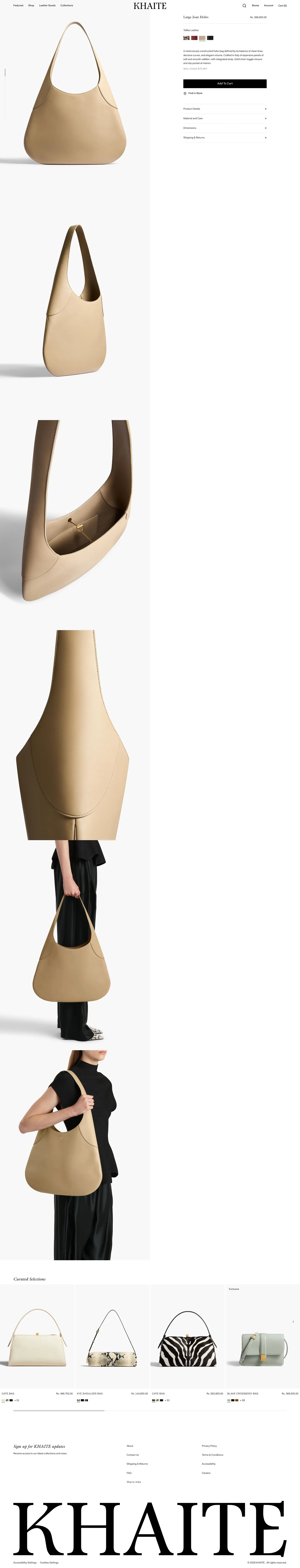
Product page add-to-cart on Khaite
Recorded example of the product page add-to-cart pattern on Khaite (product page). RecoverBase describes what this brand chose to publish and cites outside research. This is observation, not a promise of results for your store.
- Vertical
- Luxury fashion
- Stage
- Product
- Platform
- Shopify
- Verified
- 2026-05-16
- Confidence
- 0%
- Region
- US store
Start here
- You are viewing one pattern applied to one brand. Sections below spell out structure, UX research, trade-offs, and sources.
- On wide screens, use On this page at left to jump around, then open Screenshot for the capture.
First visit? A short strip under the site menu explains RecoverBase once. Dismiss it whenever you like.
A prominent, stable add-to-cart button lifts immediate buyer action when visible without scrolling on product pages for single, clearly priced items, especially if mobile sessions are significant.
What it is
A prominent, stable add-to-cart button should be visible without scrolling on product pages for single, clearly priced items.
- A prominent, stable add-to-cart button lifts immediate buyer action when visible without scrolling on product pages for single, clearly priced items, especially if mobile sessions are significant.
- Display the primary add-to-cart button without scrolling on product pages, particularly for mobile sessions, to allow buyers to act at the moment of intent.Inferred
- Ensure the add-to-cart button is visually stable and carries an unmistakable perceived affordance, using learned visual conventions rather than novel styling.[ref-product-page-add-to-cart-atc-layout-shift-misclick] web.dev (Google) (2026)[ref-product-page-add-to-cart-atc-perceived-affordance] Nielsen Norman Group (2026)
- The price must be visible on the same page before the add-to-cart button, and any variant selection (like size or color) must be complete before the button is tappable.
What research says
Visual stability and clear affordance matter for add-to-cart buttons; hesitation compounds high cart abandonment rates.
- Unexpected layout shifts around the buy area may cause shoppers to click the wrong control; the add-to-cart region tends to be more effective when visually stable before interaction (F1).Inferred[ref-product-page-add-to-cart-atc-layout-shift-misclick] web.dev (Google) (2026)
- Shoppers tend to decide if the add-to-cart control is clickable from learned visual conventions; the button should carry an unmistakable perceived affordance rather than rely on novel styling (F3).Inferred[ref-product-page-add-to-cart-atc-perceived-affordance] Nielsen Norman Group (2026)
- On mobile product pages, the primary add-to-cart control tends to be more effective when reachable without deep scrolling, allowing buyers to act at the moment of intent (F2).Inferred
- Giving the primary buy control a stronger, button-like visual weight tends to lift clicks versus a flat, low-affordance treatment (F5).Inferred[ref-product-page-add-to-cart-atc-3d-affordance-clicks] Nielsen Norman Group (2026)
- Documented online cart abandonment averages ~70% across studies; every avoidable hesitation at the add-to-cart step may compound downstream (F4).Inferred[ref-product-page-add-to-cart-atc-cart-abandonment-baseline] Baymard Institute (2026)
Trade-offs
Placing the add-to-cart button without scrolling may condense content, and 'Add to Cart' supports multi-item shopping while 'Buy Now' accelerates single-item checkout.
- Placing the add-to-cart button without scrolling can condense product descriptions or images. This trade-off weighs conversion gains against the potential loss of detail for specific page lengths.
- Choosing between 'Add to Cart' and 'Buy Now' involves a tradeoff: 'Add to Cart' helps multi-item shopping, while 'Buy Now' accelerates single-item checkout. Both have valid use cases, and 'Buy Now' can be offered as a secondary option when express checkout is available.
Other ways to do it
When products require consultation or are digital downloads, alternative processes should be used instead of a standard add-to-cart button.
- If a product requires a consultation or custom quote before pricing is known, or if it is a digital download with immediate delivery handled separately, the standard add-to-cart process should be skipped.
- For products that benefit from expedited single-item checkout, a 'Buy Now' button can be offered as a secondary option alongside 'Add to Cart', especially when express checkout is available.
Screenshot
Cropped capture from our pipeline; compare with the Start here skim above if you land here first.

Screenshot not available for this capture tier yet.
Signals
Optional thumbs-up or save. We use counts only as weak engagement hints.
Annotations
Manual notes
No manual annotations yet.